-
Templates help you create content quickly and efficiently while maintaining brand consistency. They also allow easy customization to suit various situations.
-
❷+Blank Canvas: Start designing from scratch without using a provided template.
-
❸Category: Templates are organized into intuitive categories based on different purposes and themes.
-
Find the right template by searching with keywords or browsing categories.
-
When you click a template, the Canvas opens, allowing you to freely edit text, images, videos, and widgets.
Ad Content Design and Management
Browse Templates in the Template Library
-
Ad Content is a design tool for placing text, images, videos, playlists, and widgets on a canvas.
-
Go to the Ad Design tab and click ❶New Ad Content to open the Template Library.
.png)
.png)
Ad Canvas is an intuitive tool for designing and managing screen content.
It supports monitor orientation and layout settings, adding media and widgets(images, videos, web pages, QR codes, etc.), and layer control. It also allows you to easily organize content through drag-and-drop editing.
-
❹Enter the Ad Content name in the Name field.
-
❺Monitor Orientation: Set the screen to Landscape mode or Portrait mode.
-
Landscape
-
Portrait
-
-
❻Monitor Layout: When installing multiple monitors, the following layout options are provided:
-
1 × 1
-
1 × 2
-
1 × 3
-
2 × 1
-
3 × 1
-
-
❼Background Color: Select the canvas background color.
-
❽Background Audio: You can add background music to Ad content.
-
❾Media & Widgets: Use various types of interactive content such as images, videos, web pages, and QR codes to make the Ad Content visually rich and immersive.
-
❿Top Toolbar: Includes undo/redo, layer control, duplicate, delete, zoom, and preview tools.
-
⓫Layers: Allows order change, lock, and show/hide control.
Ad Content Canvas Overview


.png)


Media & Widgets
Image : Select an image from the image library to insert into the canvas.

-
Click ❶Image button to open the image library pop-up window.
-
When you select an image, it will appear on the canvas.
-
Click the image on the canvas to display image properties on the left.
-
Image Properties :
-
Replace: Swap the current image with another from your library.
-
Fitting Options: Choose Fit, Crop, or Stretch.
-
Fit: Adjust the image to fit inside the container while maintaining its aspect ratio.
-
Crop: Enlarge the image to fill the container and crop any overflowing parts.
-
Stretch: Force the image to match the container size, which may distort its aspect ratio.
-
-
Background Color: Set the background color behind the image
-
Border: Configure color, thickness, and style (solid, dashed, dotted)
-
Shadow: Configure color, position (X/Y offset), blur, and spread
-
X Offset: Move the shadow horizontally.
-
Y Offset: Move the shadow vertically.
-
Blur: Adjust the softness of the shadow edges.
-
Spread: Control how far the shadow extends.
-
-
Border Radius: Round the corners of the image.
-
Flip Horizontal: Flip the image from left to right.
-
Flip Vertical: Flip the image from top to bottom.
-
Opacity: Controls how transparent or solid the image appears.
-
Animation:
-
Entrance Animation: Select the effect applied when the image appears.
-
Entrance Animation Speed: Adjust the playback speed (fast to slow).
-
Entrance Animation Delay: Set a delay before the animation starts.
-
Repeat Count (0 for Infinite): Set how many times the animation repeats (0 for infinite).
-
-


Video : Select a video from the video library to insert into the canvas.

-
Click the Video button to open the video library popup window.
-
When you select a video, it will appear on the canvas.
-
Click the video on the canvas to display video properties on the left.
-
Video properties are the same as image properties, so refer to the image section.
Text : Insert a styled text box into the Canvas.

-
Double-click the text box to enter or change the text.
-
Drag the text box to adjust its position on the canvas.
-
Click the text box on the canvas to display text box properties on the left.
-
Text Box Properties :
-
Font Family: Select the font type and weight (e.g., Open Sans normal 700).
-
Text Formatting: B: Bold, I: Italic, U: Underline, T: Strikethrough, X²: Superscript, X₂: Subscript
-
Text Alignment: Left, Center, or Right alignment for your text.
-
Line Height: Adjust the vertical spacing between lines of text using the slider.
-
Letter Spacing: Control the space between individual characters.
-
Outline: Set the outline color and adjust its thickness to create a border around your text.
-
Shadow: Add a shadow to the text and customize its color.
-
X Offset: Move the shadow horizontally.
-
Y Offset: Move the shadow vertically.
-
Blur: Adjust the softness of the shadow edges.
-
-
Color: Define the text color and optionally apply a background color behind the text box.
-
Document: Select a document file (Word, Excel, PDF, PPT, etc.) from the media library to insert into the canvas.

Webpage: Select a webpage from the media library to insert into the canvas.

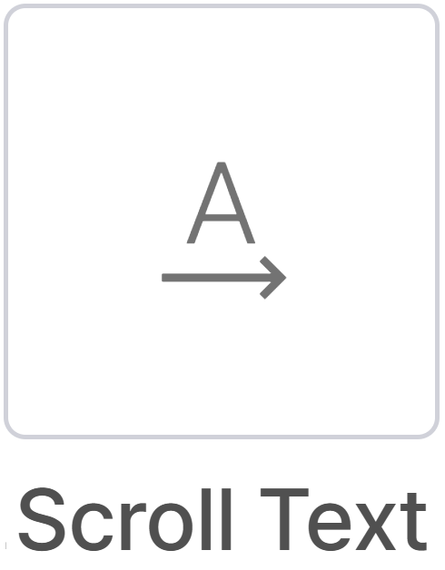
Scroll Text: Add a text area that automatically scrolls horizontally or vertically in your design, and customize the scroll speed and style.
-
Drag the scroll text box to adjust its position on the canvas.
-
When you select the scroll text box, its properties will appear on the left.
-
Scroll Text Properties :
-
Enter your message here: Type the text to be scrolled.
-
Scrolling Direction: Choose the direction of the scrolling text.
-
Scrolling Speed: Use the slider to adjust the scrolling speed.
-
Font Family: Select the font type and weight (e.g., Open Sans normal 700).
-
Camera: Primarily used in PVM (Public View Monitor) applications, it displays real-time video streams on the screen to enhance store security.

Playlist: Add a created playlist to the canvas.

Shapes: Add shapes such as rectangles, circles, and lines to the canvas.

-
Click the Shapes button to open the shapes library popup.
-
When you select a shape, it will appear on the canvas.
-
Click the shape on the canvas to display its properties on the left.
Giphy & Pixabay: Add royalty-free content to the canvas, including GIF animations from Giphy and images/videos from Pixabay.


-
Click the Giphy or Pixabay button to open the library popup window opens.
-
Enter a keyword in the search bar to find the content you want.
-
Click the selected GIF, image, or video to insert it into the canvas.
Icons: Add icons from the Google Material Symbol library and customize their color, size, and style.

-
Click Icons button to open the Material Symbol Library pop-up window.
-
After selecting a icon, it will be displayed on the Canvas.
-
When the icon is selected, you'll see the Material Symbol Properties on the left.
QR Code: Insert a QR code to provide links, app downloads, or contact details.

-
Enter QR Data: Input the URL or text to encode in the QR code (e.g., https://connectplayer.net)
-
Font & Style: Choose the font and style for any accompanying text (e.g., Poppins normal 400)
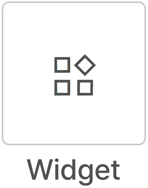
Widget: Open the Widget Library and add the desired widget to the canvas. Widgets are used to display real-time information such as weather, clock, news, or interactive elements.
Current Weather: Select the Current Weather widget from the library. It displays real-time data such as temperature, weather condition, humidity, and wind speed for the configured location, and allows customization of background image and style.

-
Current Weather Properties :
-
Select City: Check Use Device Location to use the location set during device registration. Uncheck to enter a location manually.
-
Weather Settings
-
Use Metric Units (°C, km/h): Shows temperature in Celsius and wind speed in km/h.
-
Use Background Image: Adds a background image to the weather widget.
-
-
Weekly Weather: Provides a weekly forecast based on real-time weather information such as temperature, conditions, humidity, and wind speed. Add the Weekly Weather widget to the canvas to display a 7-day forecast for the selected location, including precipitation probability and high/low temperatures.

-
Weekly Weather Properties :
-
Select City: Check “Use Device Location” to use the location set during device registration. Uncheck to enter a location manually.
-
Weather Settings
-
Use Metric Units (°C, km/h): Shows temperature in Celsius and wind speed in km/h.
-
Use Background Image: Adds a background image to the weather widget.
-
-
Analog Clock: Insert an analog clock into the canvas. Customize clock style and colors.

-
Analog Clock Properties :
-
Select City: Check “Use Device Location” to use the location set during device registration. Uncheck to enter a location manually.
-
Digital Clock: Insert a digital clock into the canvas. Configure date, time format, colors, and font style.

-
Digital Clock Properties :
-
Select City: Check “Use Device Location” to use the location set during device registration. Uncheck to enter a location manually.
-
Time Format: Choose to display the date and seconds, and select the preferred date format.
-
News Feed (CNN, ESPN, BBC): Insert a news feed into the canvas to display the latest headlines and key articles in real time.This feature automatically retrieves and updates data from specified news sources (such as CNN, ESPN, BBC), and you can customize the display style in the news properties.


Google Calendar Event: Insert Google Calendar into the canvas to display upcoming events in real time. This feature connects to a calendar ID and automatically retrieves data, allowing you to visually show meetings, events, deadlines, and more.

-
Google Calendar Event Properties :
-
Google Calendar ID: Enter the calendar ID to connect and display events from that calendar.
-
Show Nth Item: Select which calendar event to show (e.g., current or next scheduled event).
-
Refresh Interval: Set how often the calendar data refreshes (in minutes).
-
Top Toolbar

The top toolbar provides quick access to essential editing functions on the canvas. It allows you to intuitively control element positioning, layers, and data synchronization during design work.
-
❷Delete icon: Removes the selected element from the canvas.
-
❸Duplicate icon: Create an exact copy of the selected element and add it to the canvas.
-
❹Undo(Ctrl+Z) / Redo(Ctrl+Y) icon: Cancel the most recent action performed / Restore the action that was undone using Undo.
-
❺Bring Forward / Send Backward icon: Moves the selected element one layer forward or backward.
-
❻Toggle Layer Visibility icon: Shows or hides the Layer Panel on the right.
-
❼Dynamic Sync icon: Click to open the ⓫Dynamic Sync Settings window.
Dynamic Sync allows you to link design elements to Google Sheet data for real-time updates. When values in Google Sheets change, the canvas elements update automatically. Multiple text boxes or images can be linked to different cells.
Examples: Automatic price updates for stores, event schedule synchronization.
(Examples: automatic price updates for stores, event schedule synchronization)
-
❽Zoom Controls: Zoom in or out of the canvas view.
-
❾Preview: Displays a real-time preview of your design as it will appear on the screen.
-
❿Mute / Unmute: Toggles audio playback during preview mode.


-
Examples of Dynamic Sync: Here are some examples of using Google Sheets to link data to design elements.
-
To enable Dynamic Sync, create a Google Sheet where each cell is linked to a specific design element in your template. This allows all elements to update automatically based on the sheet's data.
-
Click ⓬Share in the top right corner of the Google Sheet. In the Share menu, under General access, select ⓭Anyone with the link, then click Done.
-


-
Click the ⓮design element you want to link to Google Sheets, then click ⓯Dynamic Sync icon from the Top Toolbar.
-
Enter the Google Sheet URL, Sheet Name, and Cell Reference into the ⓰Dynamic Sync Settings.

.png)
Layers Panel
-
The ⓱Layers Panel Shows all elements on the canvas, allowing you to manage their order, visibility, and properties.
-
Layer List :
-
Shows all elements in the design, such as text, shapes, icons, images, and videos.
-
Each layer is labeled by type or file name for easy identification.
-
Reorder Layers: Drag and drop layers to change their stacking order on the canvas.
-
⓲Lock/Unlock (Lock Icon): Lock a layer to prevent changes; unlock to edit.
-
⓳Visibility Toggle (Eye Icon): Toggle visibility of individual layers without deleting them.
-
⓴Delete (Trash Icon): Remove the selected layer from the canvas.
-


