➄
➀
➋
➌
➊
Assets
Assets are the building blocks of a layout. They are static objects used to display content such as text, images, shapes, and lines.
Image

Click Image in Assets panel to open ➊ Image Library, where all uploaded image files are displayed.
📌Note: If you cannot find the desired image, ➋ you can upload it directly by dragging and dropping the file from your PC’s file explorer into Image Library, without having to navigate to Media page.


➊

➋
-
Select an image from Library to add it to the canvas instantly.
-
When you select an image on the canvas, its settings appear in the left panel, and any changes made are immediately reflected on the canvas.
Image Settings
-
➊ Replace: Replaces the image selected on the canvas with another file from the library.
-
➋ Arrange:
-
Align to Canvas: Automatically aligns selected image to specific reference lines on the canvas.
-
Left/Center/Right Alignment: Positions the image along the left, horizontal center, or right edge of the canvas based on the horizontal axis.
-
Top/Center/Bottom Alignment: Positions the image along the top, vertical center, or bottom of the canvas based on the vertical axis.
-
Center on Canvas: Places the image at the exact center of both the horizontal and vertical axes at once.
-
-
Flip: Mirrors the image horizontally or vertically.
-
Horizontal Flip: Flips the image horizontally.
-
Vertical Flip: Flips the image vertically.
-
-
Position & Size: Sets the exact coordinates and dimensions of the image.
-
X, Y Coordinates: Specifies the starting position (top-left corner) of the image within the canvas.
-
W (Width), H (Height): Specifies the width and height of the image.
-
Aspect Ratio Lock (Lock icon):
-
When locked, changing the width (W) or height (H) automatically adjusts the corresponding dimension while maintaining the original aspect ratio.
-
When unlocked, the width and height can be adjusted independently.
-
-
-
-
➌ Scale Mode: When you click an image on the canvas, Selection frame appears around the image. Dragging the corner handles will resize the image while maintaining its original aspect ratio, while dragging the top, bottom, left, or right side handles will behave according to the selected Scale Mode:
-
Fit (Keep Aspect Ratio): The entire image is displayed within Selection frame while maintaining its original aspect ratio. If the aspect ratio of Selection frame differs from that of the image, empty space (letterboxing) may appear on the top/bottom or left/right.
-
Fill (Crop to Fill): The image fills Selection frame while maintaining its original aspect ratio. Areas of the image that extend beyond Selection frame will be cropped.
-
Stretch (Distort to Fill): The image is forced to stretch or shrink to fit Selection frame, ignoring its original aspect ratio. While it fills the frame, this will cause distortion in the image.
-
-
➍ Background Color and Opacity:
-
Background color: Sets the background color of the image.
-
Opacity: Sets the opacity of the image.
-
-
➎ Border:
-
Color: Sets the color of the border.
-
Thickness: Sets the thickness of the border.
-
-
➏ Corners: Sets the corner radius of the image. Click the link icon in the center to apply the same corner radius value to all four corners simultaneously.
-
Adjustments: Fine-tune the visual appearance of the image.
-
Brightness: Adjusts the brightness of the image.
-
Contrast: Adjusts the difference between the light and dark areas of the image.
-
Saturation: Adjusts the intensity and vividness of the image colors.
-
-
Shadow: Adds a shadow effect to the image.
-
Enable Shadow: Turn on the switch to enable the shadow effect.
-
X Offset / Y Offset: Sets the horizontal (X) and vertical (Y) position of the shadow.
-
Blur: Adjusts the softness and blur level of the shadow.
-
Color & Opacity: Sets the color and opacity of the shadow.
-
-
➐ Animation: Adds animations to enhance image assets and create a more dynamic visual presentation.
-
Animation Type: Select the animation effect to be applied to the image from the dropdown menu.
-
Back In [Direction]: Enters from the specified direction, overshoots slightly, and settles with a bouncy motion.
-
Bounce In: Appears by bouncing and gradually scaling up to its final size.
-
-
Speed: Use the slider to adjust the playback speed of the animation. Move the slider left to increase the animation speed or right to decrease it.
-
Delay: Use the slider to set the delay time before the animation starts.
-
Repeat Count (0 = Infinite): Set the number of times the animation will play. Adjust the slider to specify the desired count; setting it to 0 will cause the animation to repeat infinitely.
-

➋
➊

➌
➍


➎

➏
➐

Video

-
Click Video in Assets panel to open Video Library. Selecting a video from the library will immediately add it to the canvas. Selecting a video in Video Library will immediately add it to the canvas.
-
Click a video on the canvas to display its settings in the left panel. Changes made to these settings will be reflected on the canvas in real-time.
Note: For detailed information on Video Settings, please refer to Image Settings.
Text

-
Click Text in Assets panel to add a text to the canvas.
-
Double-click the text to enter or modify its content, or drag it to any position on the canvas. Selecting the text will display the Text Settings panel on the left, where you can adjust its settings.
Text Settings
-
➊ Font:
-
Font Family: Select the desired font and weight from the dropdown menu (e.g., Open Sans, Bold 700).
-
Font Size: Set the size of the font.
-
-
➋ Text Style:
-
Text Formatting: Apply text styles using the following controls:
-
B (Bold): Applies bold formatting to the text.
-
I (Italic): Applies italic formatting to the text.
-
U (Underline): Adds a line under the text.
-
T (Strikethrough): Adds a line through the middle of the text.
-
X² (Superscript): Raises the text above the baseline.
-
X₂ (Subscript): Lowers the text below the baseline.
-
-
Alignment: Align the text to the left, center, or right.
-
Spacing:
-
Line Height: Adjust the vertical spacing between lines of text.
-
Letter Spacing: Adjust the horizontal spacing between characters.
-
-
Outline:
-
color: Set the color of the outline.
-
Thickness: Adjust the thickness by dragging the slider.
-
-
-
➌ Color:
-
Font Color: Set the color and transparency of the text.
-
Background Color: Set the color and transparency of the text background.
-

Document
-
To add a document (Word, Excel, PDF, PPT, etc.) to the canvas, click Document in Assets panel to open Document Library. Documents previously uploaded to Media page will appear in this window.
-
Once you select a document, it is added to the canvas, and Document Settings are displayed in the left panel.
📌Note: If you cannot find the desired document file, you can upload it directly by dragging and dropping it from your PC’s file explorer into Document Library, without having to navigate to the Media page.
Web Page

-
To add a webpage to the canvas, click Web Page in Assets panel to open Web Page Library. The web pages uploaded to Media page are displayed in the library.
-
Select a web page from the library to add it to the canvas.
Scrolling Text
-
You can display text as a scrolling ticker, which is effective for delivering announcements, news, and promotional information.
-
Click Scrolling Text in Assets panel. You can drag it to any position on the canvas, and use Scrolling Text Settings panel in the left sidebar to enter your message and customize its design.
Scrolling Text Settings :
-
Text to show:
This is an input field where you can directly type the text content you want to display on the screen with a scroll effect.
-
Scroll Direction:
This sets the direction in which the text moves. You can choose to have the text move to the left (<), upward (^), downward (v), or keep the text fixed without movement (■).
-
Scrolling Speed:
By adjusting the slider, you can set the speed at which the text moves. Moving the slider to the right increases the speed of the text movement.

Camera

Cameras are primarily used for the following two purposes:
-
Store Security and Real-time Monitoring: Through the camera widget in Public View Monitor (PVM) applications, real-time video streams are displayed on digital signage screens to enhance store security.
-
Audience Data Analysis and Strategy Planning: The system detects faces via the camera to estimate and categorize demographic data such as gender and age. This data is then analyzed by metrics, time of day, and day of the week to help develop efficient store management strategies.
-
Click Camera in Assets Panel to add a camera element to the canvas. You can drag and drop it to any desired position on the canvas.
-
Resizing:
-
Maintain Aspect Ratio: Drag the corner handles of the camera element to resize it while maintaining the original aspect ratio.
-
-
Camera Video Output Settings: Even if you add a Camera Asset to the canvas, the actual physical camera must be connected to your device. Additionally, you must select USB Camera or ONVIF Profile S in Device Settings for the video to display properly.

Note: Camera video is not displayed in Layout Editor Preview mode. Please verify camera playback on the actual device.
Playlist

You can add a Playlist to the canvas to play multiple videos or images in a loop on a single screen.
Click Playlist in Assets Panel to open Playlist Library. Select a playlist from the Playlist Library to add it to the canvas.
Shapes

You can enhance your design by adding shapes such as rectangles, circles, stars, and arrows to the canvas. Once added, you can customize their appearance, including size, color, and borders.
To add a shape, click Shapes in Assets panel, select your desired shape from Shape Library, and the selected shape will be added to the canvas.
Icons

You can add various icons to the canvas using the Google Material Symbol library. Use these graphical assets to improve visual clarity and communication by placing them within your layout to effectively convey meanings such as menus, notifications, and information.
To add an icon, click Icons in Assets panel, select your desired icon from Material Symbol Library, and the selected icon will be added to the canvas.
QR Code

You can add a QR code to the canvas to provide website links, app downloads, contact information, and more.
-
Click QR Code in Assets Panel to add it to the canvas.
-
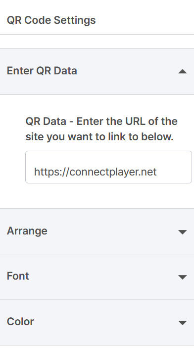
Select QR Code on the canvas to open QR Code Settings panel in the left sidebar.
-
In this panel, you can enter the data to be linked to the QR code and customize its design (color, style, etc.).
QR Code Settings
-
Enter QR Data: Enter the URL you want to link to (e.g., https://connectplayer.net)


Products
Use Cases