Media Management
Media Page Layout
Media page is a dedicated space for systematically managing all media files uploaded to the server and reviewing detailed information for each item.

➎
➌
➋
➊
➍
➊ Media Explorer (Left Sidebar): A tree-structured menu that categorizes stored media files by type. Clicking a Category Filters and displays the corresponding media files in the main screen.
-
All Media: Displays all uploaded media files in one consolidated view.
-
Categorization: Allows you to filter and view files by type, such as Favorites, Image, Video, Audio, Document, and Web Page.
➋ Media Card: An interface that visually presents individual uploaded media files.
-
Status Monitoring & Management: Media cards provide various tools to monitor the status of uploaded media and manage them efficiently.
-
Click For Details button: Click this button in the center of a card activate ➌ Details Panel on the right side of the screen.
-
➍ Multi-selection: Clicking the checkbox at the top left of the cards allows you to select multiple files simultaneously for sharing or deletion.
➎ View Mode: You can switch the layout for viewing media in the following ways:
-
List View: Lists detailed media information in a vertical format, which is useful for comparing or checking many items at once.
-
Card View: Displays media as thumbnail-based cards, which is suitable for intuitively identifying visual information and status.
Media Card
Media Card provides various tools to monitor the status of uploaded media and manage them efficiently.
➊ Thumbnail: Displays a representative image of the media file on the media card; for video files, hovering the mouse over the media card automatically plays a 5-second preview clip.
➋ Media Type Icon: Allows for easy identification of the media's file format.
➌ Star Icon (Favorites): Click this icon to add the media item to your favorites. You can access all favorite media from Media > Favorites in the left navigation menu.
➍ Click For Details button: Click this button in the center of a card activate Details Panel on the right side of the screen.

➎
➍
➌
➋
➊
➎ Deploy to Devices Icon : Click this icon to open Device Selection Window and ➐ choose the devices that will receive the media. After selecting the devices, click ➑ Deploy to Devices button in the upper-right corner. The selected devices will automatically download and play the media.
➒ Scale Mode: Sets the display method for content when outputting to a display monitor. You can select from three modes based on whether to maintain the content's aspect ratio and how to fill the monitor screen.
-
Fit (Keep Aspect Ratio): The content is displayed on the screen while maintaining its original aspect ratio. If the aspect ratio of the content differs from that of the monitor, empty space (letterboxing) may appear on the top/bottom or left/right.
-
Fill (Crop to Fit): The content fills the display monitor while maintaining its original aspect ratio. In this case, if the aspect ratios differ, the parts of the content that extend beyond the monitor area may be cropped.
-
Stretch (Force Fit): The content is forced to stretch or shrink to fit the monitor screen, ignoring its original aspect ratio. While it fills the screen completely, this may cause distortion in the content.

➑
➒
➐
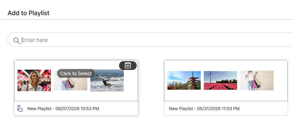
Quick Add to Playlist : You can add media to your desired playlist directly from the media page without navigating through complex steps.
-
Click ➓ Quick Add to Playlist icon for the media you wish to add.
-
In the ⓫ Playlist Selection window that appears, click the ⓬ Select button for your desired playlist; you will be redirected to ⓭ Edit Playlist, ⓮ where you can verify that the media has been added.
.jpg)
➓
⓬
⓫

⓮
⓭
⓯ More Options Icon:
-
Open in New Tab: Previews the selected media file in its original size in a new browser tab.
-
Download Media File: Downloads the uploaded media to your PC for editing or backup.
-
Share [Pro Cloud]
-
By default, media files are available only to users within the same group.
-
The Share feature allows users in other groups to view and use the media, making collaboration and content management more efficient.
-
Click Share to open a dropdown menu and select the groups you want to share the media with.
-
-
Delete: Permanently deletes the media file from the system.

⓯
Media Details Panel
Media Details panel allows you to check the detailed properties of the selected media. Clicking Click For Details button on Media Card will display Media Details panel on the right.
-
Preview Area: Provides a preview of the currently selected media. You can click the ➊ Full Screen icon in the bottom right corner to view the image in a larger format.
-
Content Type: Displays the format of the media file (e.g., image, video).
-
Name: The unique name of the file. You can edit the file name by clicking next to the pencil icon.
-
Date Registered: The date and time the media was first uploaded to the system.
-
Resolution: Displays the horizontal and vertical pixel dimensions of the image.
-
Size: Indicates the file size.
-
Uploaded By: The account name of the user who uploaded or managed the content in the system.
-
Note: An area where you can record memos or descriptions about the image. You can enter or edit the content by clicking next to the pencil icon.

➊


Products
Use Cases